What we want to convey
We are not trying to appeal to the mass market. Our goal is not to be another horizontal, undifferentiated project management tool. The world doesn’t need another Asana, Trello, Linear, Notion, Airtable, Monday.com, ClickUp, Jira, Wrike etc. We are focused specifically on marketing teams. Great marketing is part art, part science. You need both, and we are the best platform on the planet to manage the science part.What we want to look and sound like
Our aim is to look and feel less like a brand agency and more like engineering company - think GitHub and SpaceX, not Ogilvy and WPP. Words that reflect who we are:Science, testing, process, evidence, data, numbers, data, hypotheses, experiments, frameworks, metrics, logic, evidence, analytics, rigour, agile and measurable.Words we try to avoid:
Art, brand, opinions, beliefs, uncertainty, big bets, media, agency, awareness, powerpoint, opinions, assumptions and annual planning.
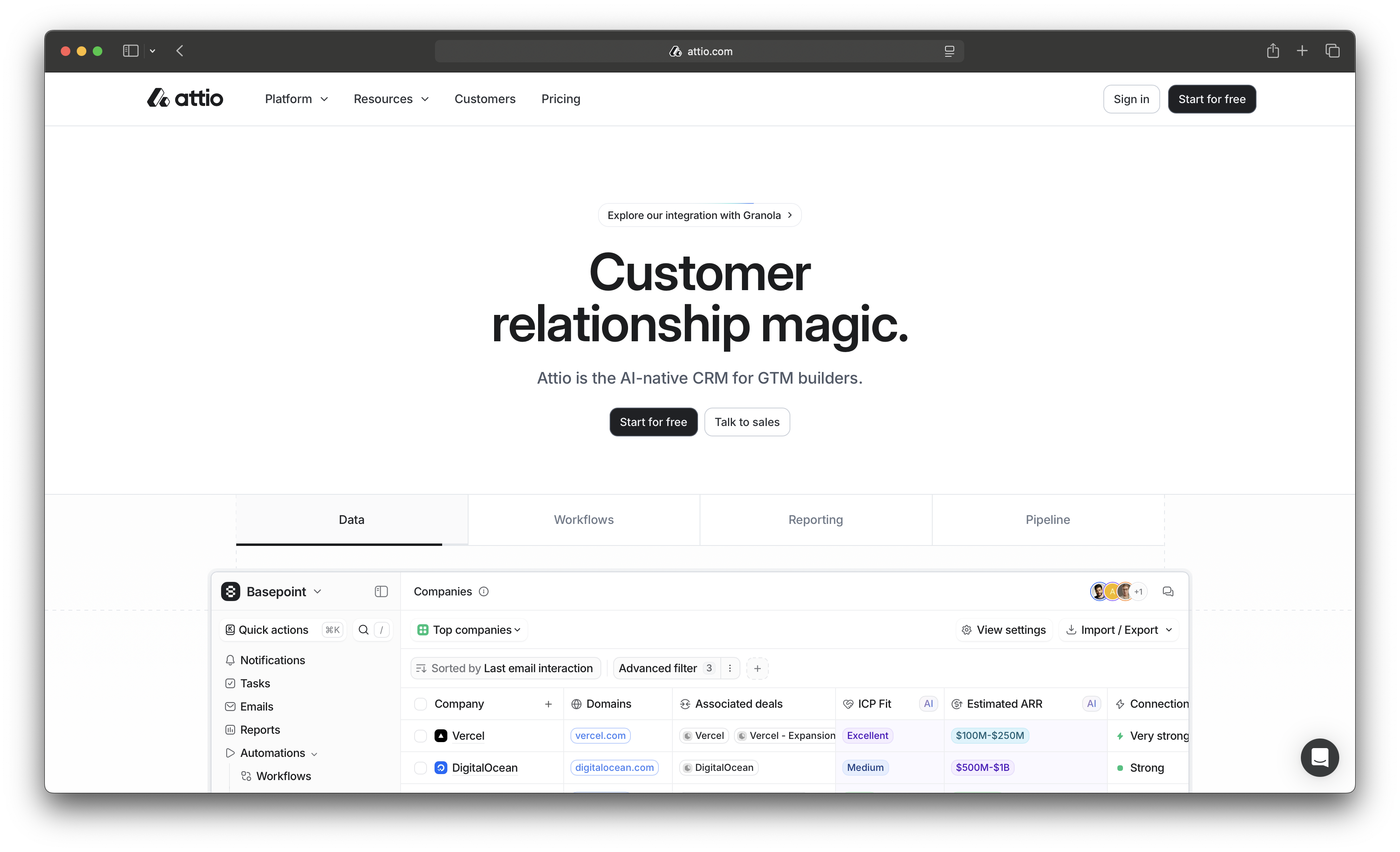
Inspired by Attio
We love Attio (https://attio.com/) as a new company competing in the ultra competitive CRM space. They have achieved differentiation with a high-end engineering feel:- No loud primary colours
- Dark neutrals
- Lots of whitepsace
- Minimal distractions (minimal but not cold)
- Strong typography
- Subtle gradients
Colours
See colours guideTypography
See typograpy guideImagery
Use this prompt for AI image generationAdditional style guidelines
Other considerations:- Minimalist, clean and simple
- Sharp/square edges (rather than rounded)
- Square buttons, no rounded edges
- Other useful tips https://jasonlbeggs.com/blog/tips-for-good-ui-implementation
- Refactoring UI https://www.refactoringui.com/
- Tailwind UI https://tailwindcss.com/plus/ui-blocks#product-application-ui
- FluxUI https://fluxui.dev/
- shadcn https://ui.shadcn.com/